A good font face can create quite an impression in the minds of readers and website visitors. With the advancement of PCs smartphones in the last decade, selecting the right typography for your website or app has become more important than ever.
An idea of the best fonts for your project can be quite handy. Choosing a good font is not only appropriate in terms of aesthetics but provides a high level of legibility for users if the viewport is of small size.
A font can easily be the most subtle, and yet powerful differentiator for the UI of a mobile app or website.
The Best Fonts for Web and Mobile Development
Here are the 5 best fonts from our team that you may use in your next website development or mobile app development.1. Open Sans
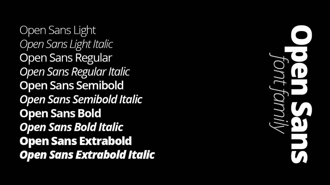 Open Sans is a wonderful font for varied purposes. It is readable in even its small size and also looks great when the text is printed in huge letters. The greatest thing of all, it’s a free font! You are free to use and download it for your upcoming design project. It’s a well recognized and modern font that is being widely used on upcoming websites. Because of its simplicity, it makes your content simple to read. The same thing goes for offline content. When printed in Open Sans, your documents will look amazing as well. Font Source: Google Fonts
2. Montserrat
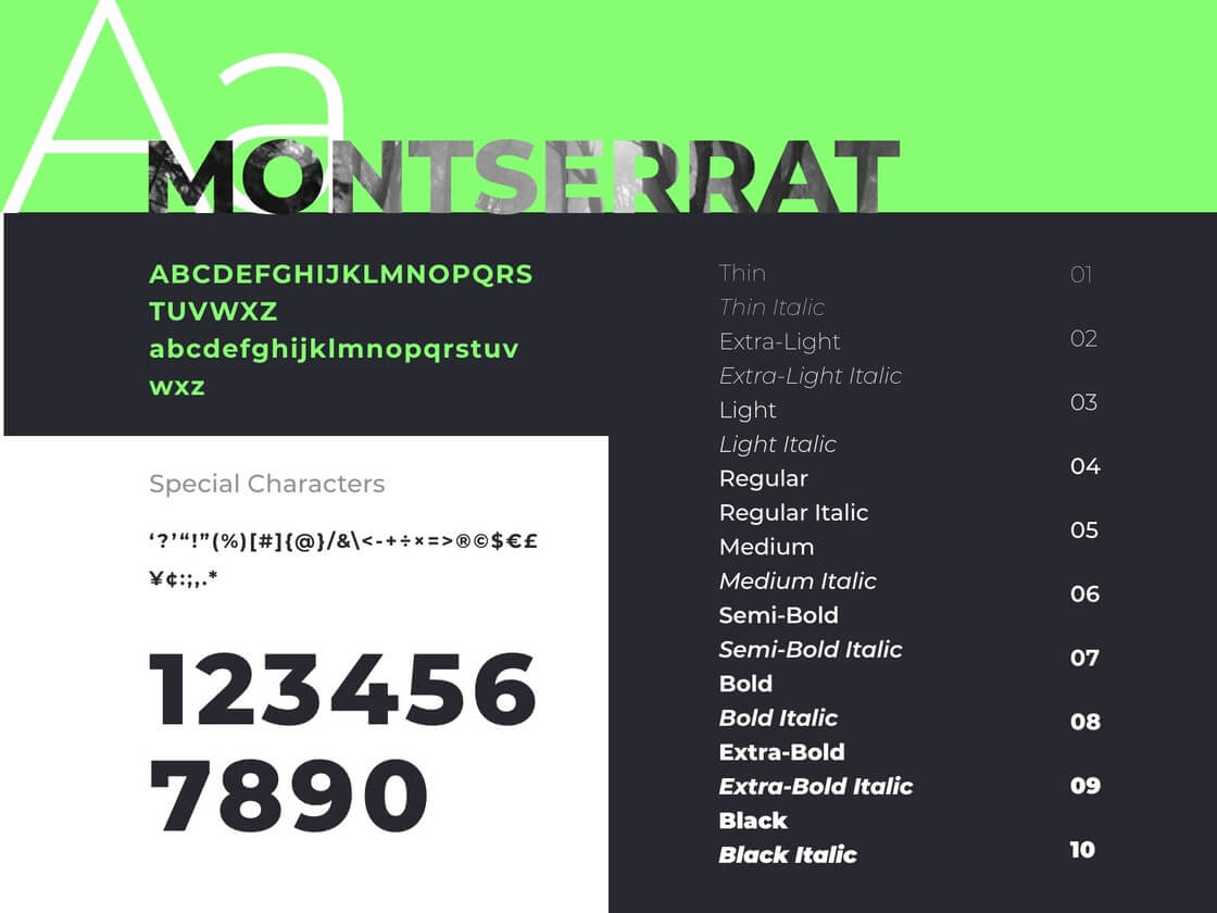 This typeface comes in three variants and evokes the modernist technique of the early 20th century, however, it feels less formal than, say, Futura. Montserrat really shines for short pieces of all caps and the geometric simplicity of the letters. Even in lowercase, Montserrat is still a pretty pleasant font with a nice large x-height and a lot more character than Arial or Helvetica. Font Source: Google Fonts
3. Poppins
Poppins is one of the Geometric sans serif typefaces that have been a popular design tool for building websites. Each letter form is nearly mono-linear, with optical corrections applied to stroke joints where necessary to maintain an even typographic color. It supports both Latin and Devanagari languages and is available in nine weights with matching italics. Font Source: Google Fonts4. Proxima Nova
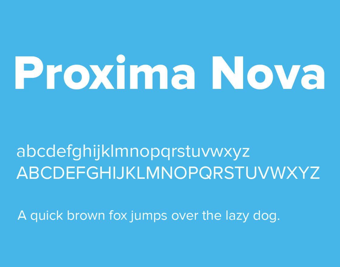 Proxima Nova links the gap between typefaces like Futura and Akzidenz Grotesk. The outcome is a hybrid that combines modern proportions with a geometric appearance. Proxima Nova, by various measures, has replaced Helvetica as the world’s most popular typeface. Proxima Nova carries the style of Futura, but is functional and can communicate clearly like Helvetica. Font Source: Typekit
5. San Francisco
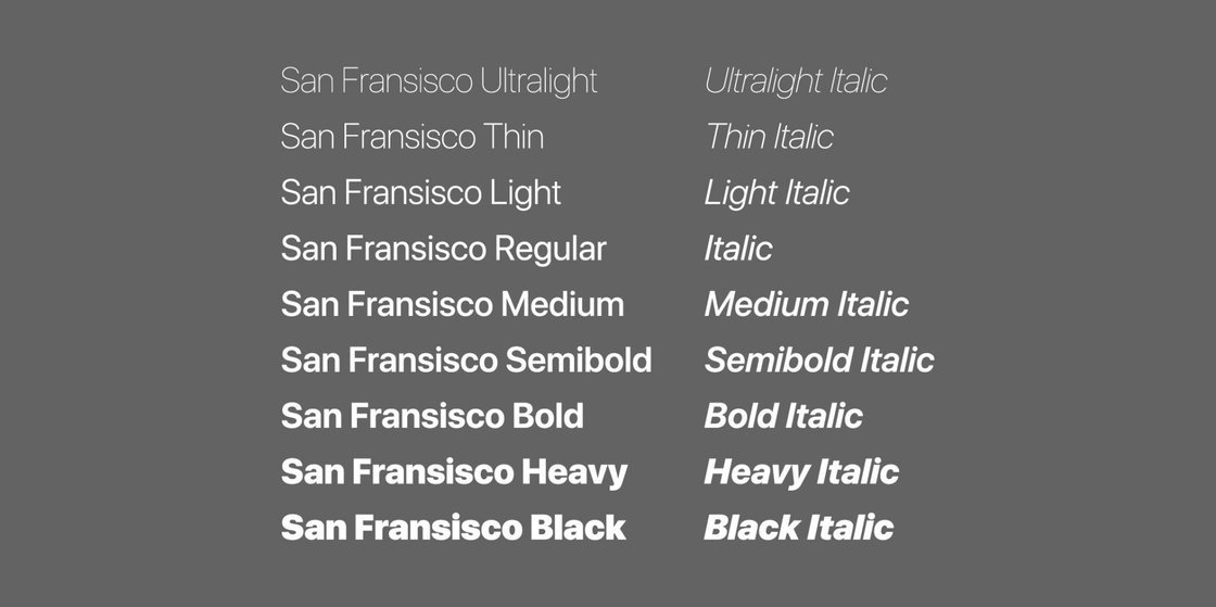 Helvetica Neue and San Francisco are natural to mistake for one another. That is because San Francisco is so heavily inspired by Helvetica Neue. But, Apple made some key changes that make it a much better – maybe even perfect – typeface for their platforms. San Francisco is easier to read on-screen and has gradually replaced most of Apple's other typefaces on their software and hardware products and for overall branding.
Font Source: Github Without a doubt, typography is one of the most critical elements of UX design but the question "What are the best fonts for apps and websites?" is going to elicit a multitude of responses.
The answer is, it depends.
It depends on a range of different factors, from audience demographic and cultural context to device use and product objectives.
Whichever fonts you decide on, limit yourself to using just one or two at a time. Sometimes simply using one font in various weights can be just as effective as using multiple fonts. Looking for an efficient mobile app or web app for your business?
Contact us to help you get a feature-oriented and visually stunning cross-platform mobile app or website for your business model. Do you have any favorite UI fonts? Please mention them below in the comments.